Sans Serif
This educational and tongue-in-cheek poster not only defines the term sans, it also references the type classification’s historical beginning and celebrates its liberation from serif type.
. . . . . . . . . . . . . . . . . . . . . . . . . . . . . . . . . . . . . . . .
Artist, design educator and award-winning graphic designer Tom Davie has recently expanded his line of exquisite and cleverly conceptual typographic goods to include not only art prints but also note cards and matted print sets. As ′tis the giving season, these would make spot on gifts for both typography and linguistic geeks—plus lovers of photography, design and elegant photo illustration.
shop >> note cards & matted prints // shop >> art prints // view >> portfolio
. . . . . . . . . . . . . . . . . . . . . . . . . . . . . . . . . . . . . . . .
[ All work & images ©Tom Davie, studiotwentysix2 ]

Blackletter
Photographed 3-D two-tone blackletter paper sculpture overlaid with an original graphite line drawing.

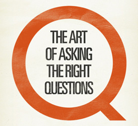
Typographic Hype
Photographed 3-D letterform sculpture overlaid with an original graphite line drawing.

Typographic Prints/ Set of 5 matted prints
Each set is hand numbered and has been limited to a first edition print run of 500. These offset lithographic prints were produced in the United States on Mohawk Superfine 80lb. cover stock, an eco-friendly paper. The mats are a thick conservation quality museum rag with a 45° bevel.
Learn more >>

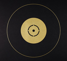
Can O’ Dingbats
An ode to Hermann Zapf’s Zapf Dingbats. All of the elements and icons used in this piece are from that single source.

Typographic Note Cards / Set of 10 cards + envelopes
Five of my most popular poster designs were selected for this typographic set. These offset lithographic cards were printed in the United States on Mohawk Superfine 80lb. cover stock, an eco-friendly paper. The accompanying envelopes are a beautiful steel blue paper stock and are 100% recycled.
Learn more >>

Paragraph Indentation
Photographed in natural light, this piece is based on the typographic suggestion that paragraph indentation should be a one-em space.
. . . . . . . . . . . . . . . . . . . . . . . . . . . . . . . . . . . . . . . .
Psst… you can grab the AQ-V RSS Feed and follow AQ-V on Twitter.
. . . . . . . . . . . . . . . . . . . . . . . . . . . . . . . . . . . . . . . .
You may also enjoy: